Type Poster: Adobe Jenson Pro
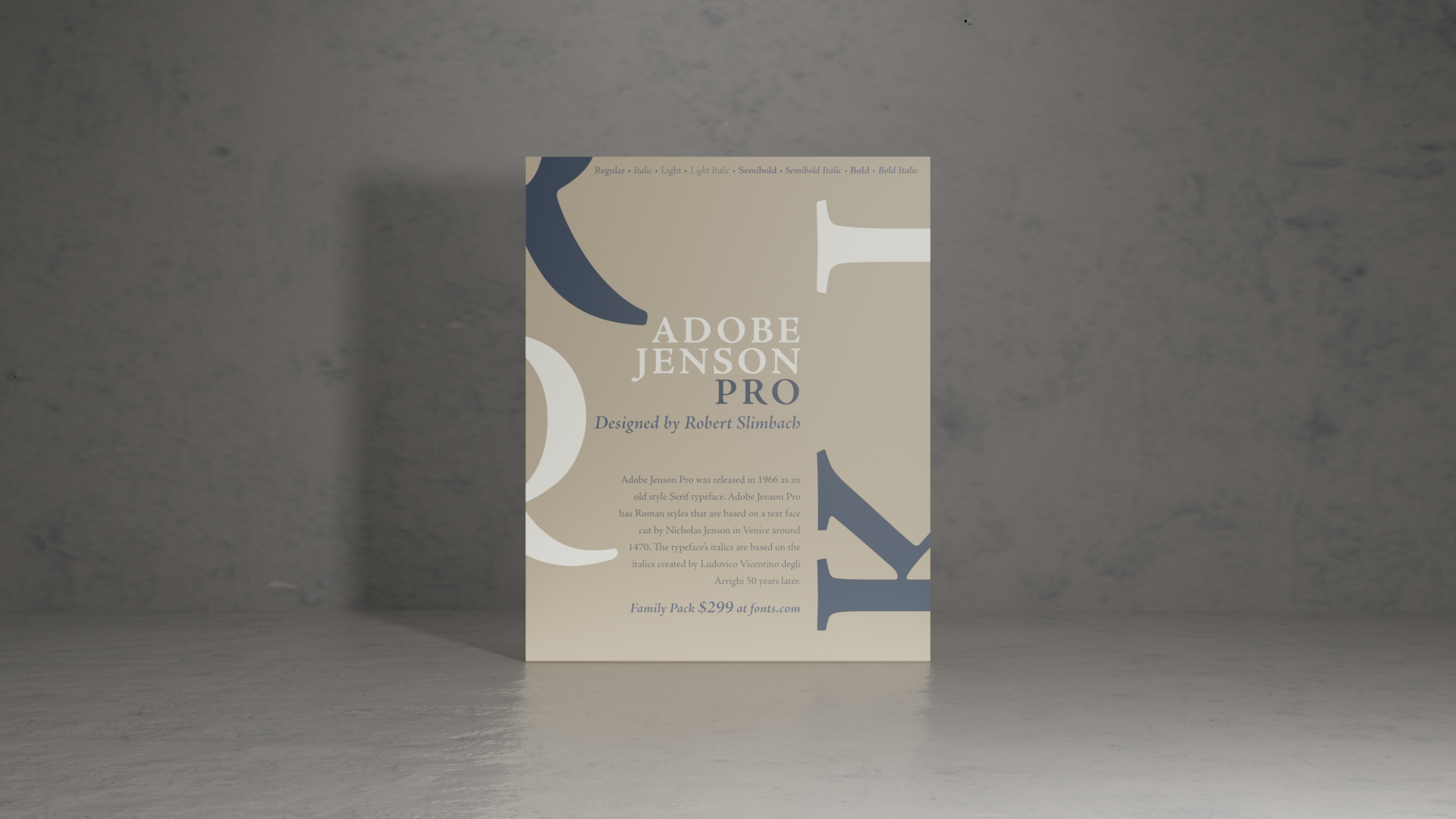
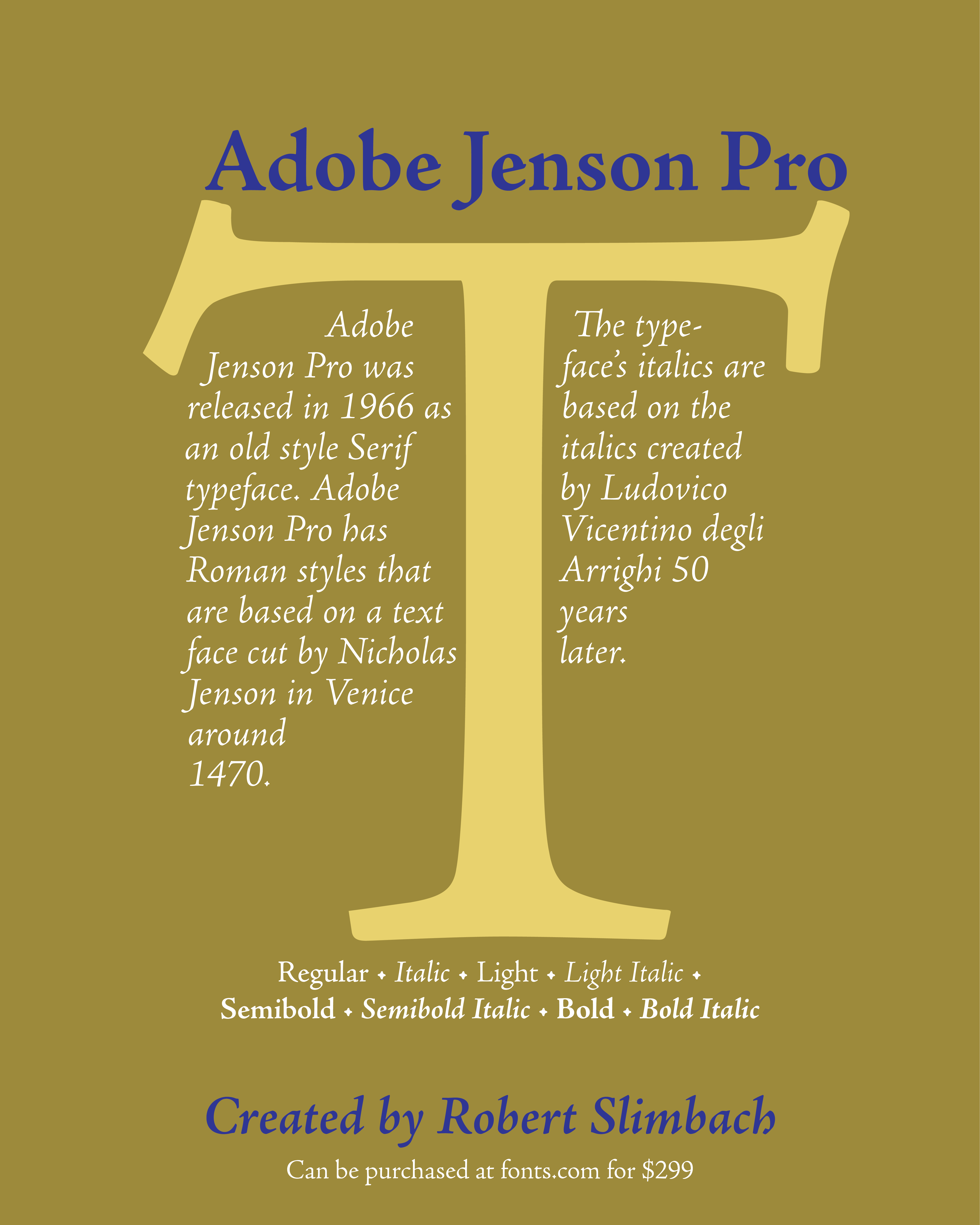
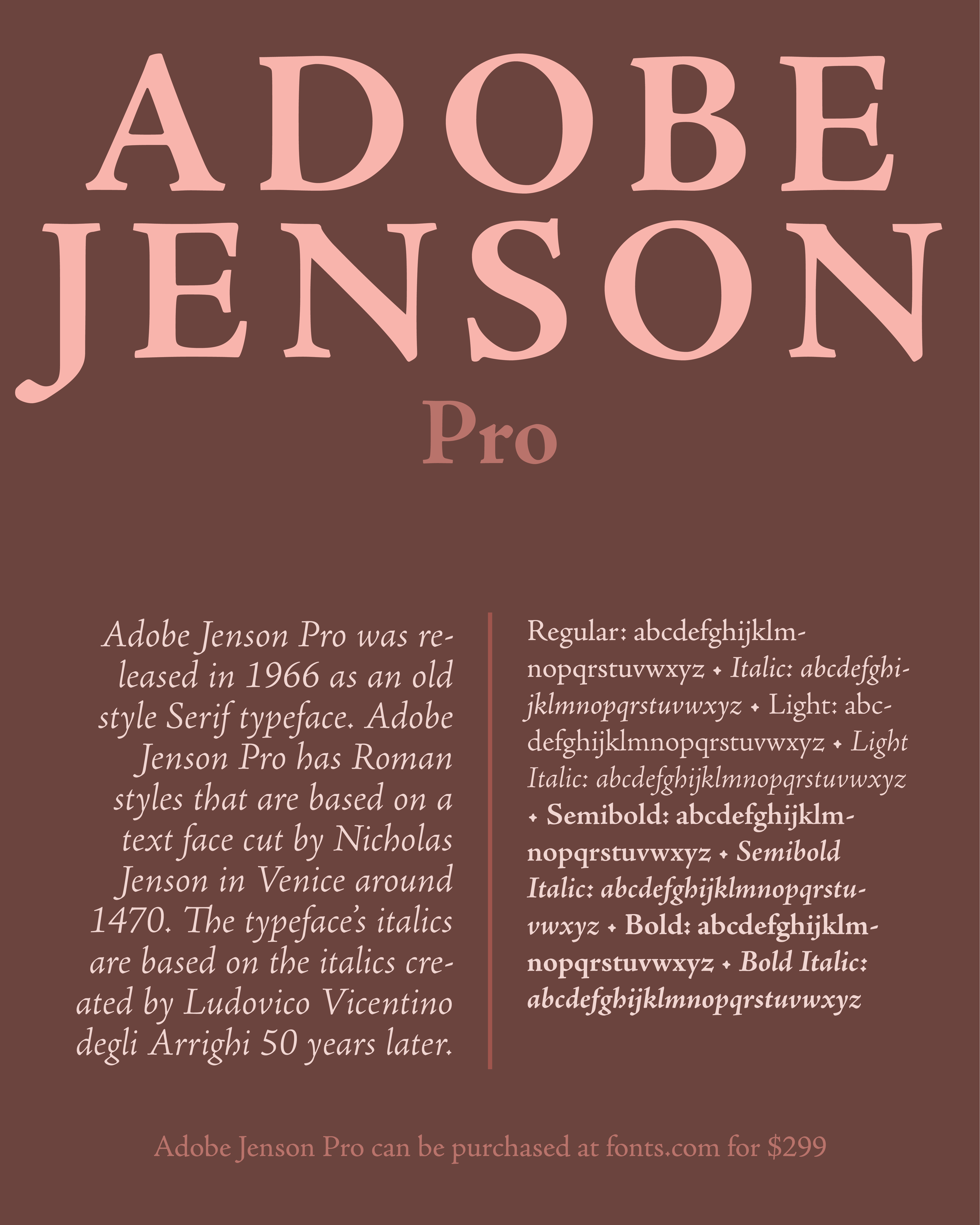
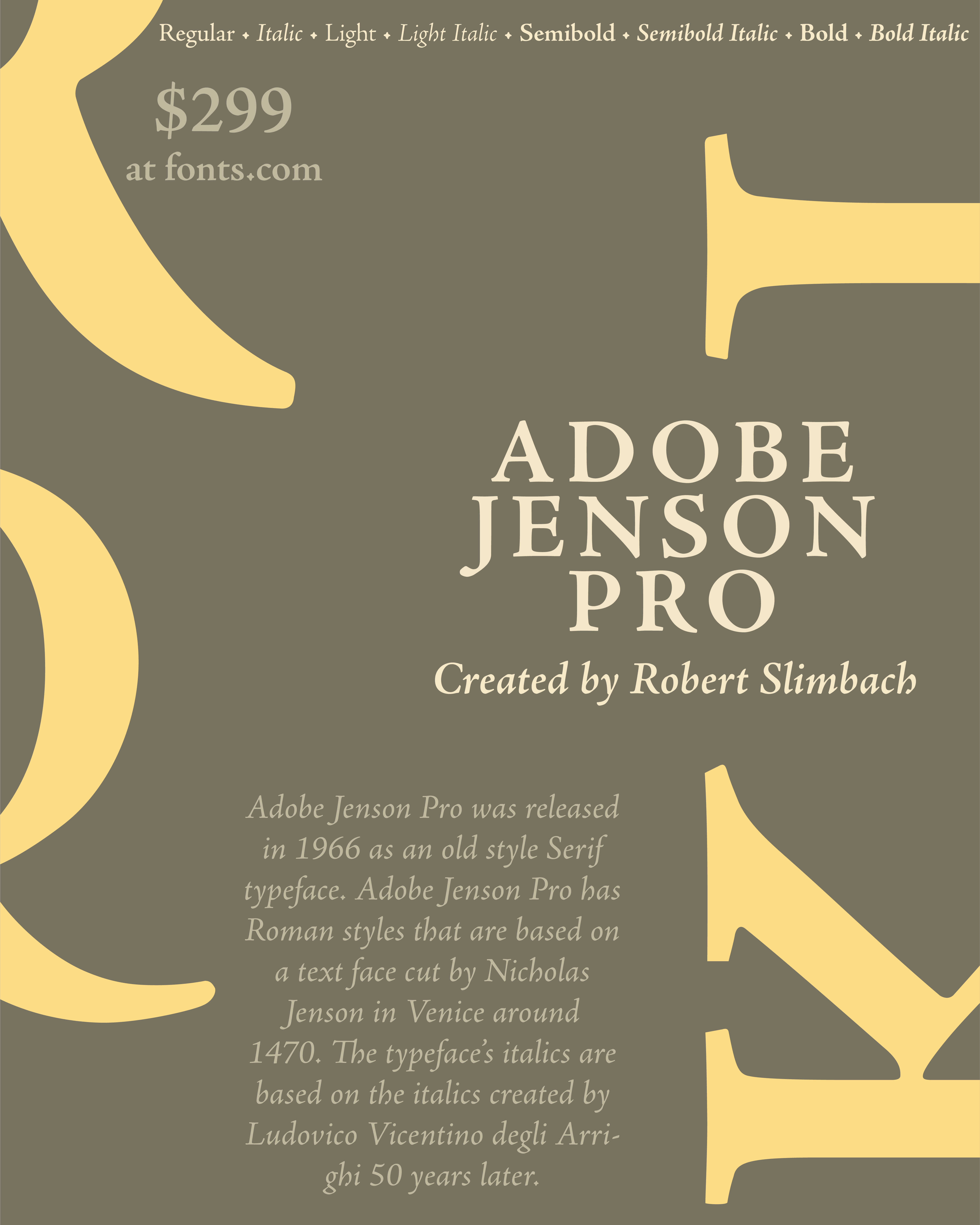
I created a type poster to showcase Adobe Jenson Pro and all the specifics of the font from font looks to pricing. Just above you can see process photos of designs I initially created for the type poster. I initially just began creating layouts, and then chose one layout to develop further with feedback from my peers.
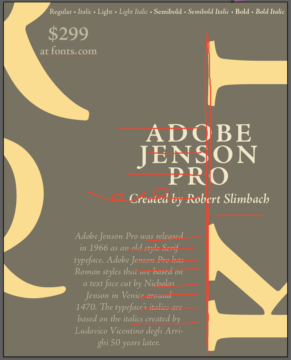
To the left you can visually see the feedback that was given for the layout I chose to develop further. It was suggested that I right align the text elements to prevent the poster from looking busy. Some other things were suggested as well like changing sizing and positioning of some elements on the poster.

Before

